LOGO OPTIONS
The L&M brand system contains several different logos lockups. They range from simple to more complex with information that supports the brand.
Use your best judgement when applying different logos and consider the other content surrounding the logo to avoid repetitive information.
Primary Logo
This logo can be used in most applications. It is good for small-scale usage in horizontal layouts.
Offerings Logo
This logo can be used in large- to medium-scale applications when the logo needs to be locked up with the primary store offerings.
Location Logo
This logo can be used for large- to medium-scale applications when location information needs to be locked up with the logo.
Circular Offerings Logo
This logo can be used in square or circular applications when the logo needs to be locked up with the primary store offerings.
Simplified Location Logo
This logo can be used in small- to medium-scale applications.
Left Alignment Logo
This logo can be used in most applications. It is good for small-scale usage in horizontal layouts that calls for a left side alignment. Should not be centered in a layout.
Monogram-Only Logo
This logo should be used for small scale applications like favicons, social media avatars, etc. when there is other information to support the brand.
LOGO USAGE GUIDELINES
Here are some basic dos and don’ts for using the logo.
Clear Area
Spacing around the logo should equal 10% the full width of the logo lockup (including address, offering, etc. information). For example, if the logo is 24 inches wide there should be at least 2.4 inches of space surrounding it on all sides.
Keep this spacing in mind when showcasing partnerships or lockups with other brands or organizations.
Correct Color Usage
There are several ways you can display the logo in color and on color backgrounds.
Royal Bleu logo on a white or Whipping Cream color background.
White or Whipping Cream logo on a Royal Bleu background.
Poppy Seed gray logo on a white or Whipping Cream color background
White or Whipping Cream logo on a Poppy Seed gray background.
Royal Bleu logo on a white or Whipping Cream color background with Chicago Blue (75% opacity) illustration. If you’re using illustrations behind the logo or any other design element make sure that all text is still readable.
White or Whipping Cream logo on a Royal Bleu background with dark illustration overlay. If you’re using illustrations behind the logo or any other design element make sure that all text is still readable.
WHAT NOT TO DO
These are some general examples of inappropriate use of the logo
Do NOT compress the logo to fit a space
Do NOT change the font in the logo (especially not to Comic Sans)
Do NOT use the logo in colors not in the brand guide.
Do NOT mix approved brand colors in the logo
Do NOT use the logo in unapproved color combinations
Do NOT use the logo in unapproved color combinations
Do NOT use illustrations in unapproved colors that hinder logo readability
Do NOT lock up L&M logo with partners without the correct clear space around the logo
PRIMARY BRAND COLORS
These colors can be used as the dominant colors for L&M materials. The logo can be used in white on these colors, or in these colors on a white or light background.
Royal Bleu
Print:
c: 90 m: 55 y: 00 k: 00
Digital & Web:
r: 000 g: 110 b: 183
hex: #006EB7
Poppy Seed
Print:
c: 60 m: 60 y: 75 k: 50
Digital & Web:
r: 72 g: 63 b: 48
hex: #483F30
SECONDARY BRAND COLORS
These colors are meant to support the primary brand colors and should not appear as prominently across branded materials.
Crab Red
Print:
c: 00 m: 79 y: 88 k: 00
Digital & Web:
r: 241 g: 93 b: 52
hex: #F15D34
Chicago Blue
Print:
c: 17 m: 00 y: 02 k: 00
Digital & Web:
r: 208 g: 236 b: 246
hex: #D0ECF6
Whipping Cream
Print:
c: 03 m: 02 y: 07 k: 00
Digital & Web:
r: 244 g: 243 b: 234
hex: #F4F3EA
TYPOGRAPHY
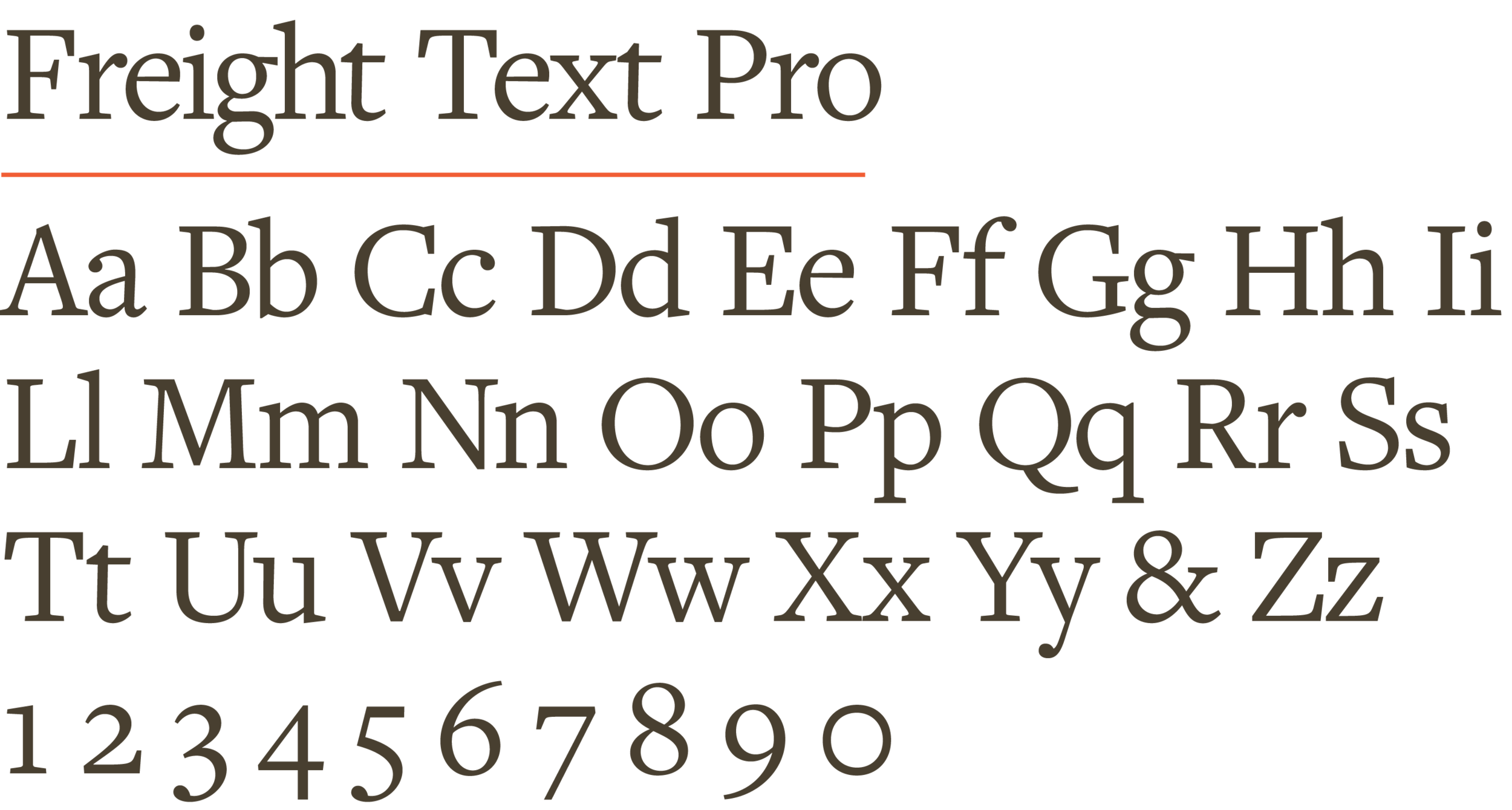
L&M branded materials us the Freight family of fonts. They can be used via Adobe Typekit or purchased via Phil’s Fonts.
Display Fonts
Freight Big Pro and Freight Neo Pro should be used for headlines and larger pieces of copy.
Body Copy Fonts
Freight Text Pro and Freight Sans Pro can be used for smaller copy like full sentences and paragraphs and captions.
BRAND TONE AND VISUAL STYLE
These are some visual cues that can be used to better understand the essence of the brand’s visual identity.
